2021
The brief for this project was to tell a story using digital interactive storytelling mediums. For this assignment, I teamed up with one of my classmates and we decided to create a dystopic example of our future post-climate change.
My favourite part of this project was building the brand identity that would be featured in marketing campaigns to give audiences a taste of what to expect from our video. We came up with the concept of using glitch effects and digital typefaces to contrast the dystopic future with the nostalgic past. I worked on creating a logo and posters to show how we would promote our story.
I looked into existing film posters from the dystopian thriller genre for inspiration before sketching out ideas for our own.
Our ideas revolved around the use of a VHS tape to solidify our nostalgia idea, this concept allowed us to play with the idea of rewinding and fast-forwarding.
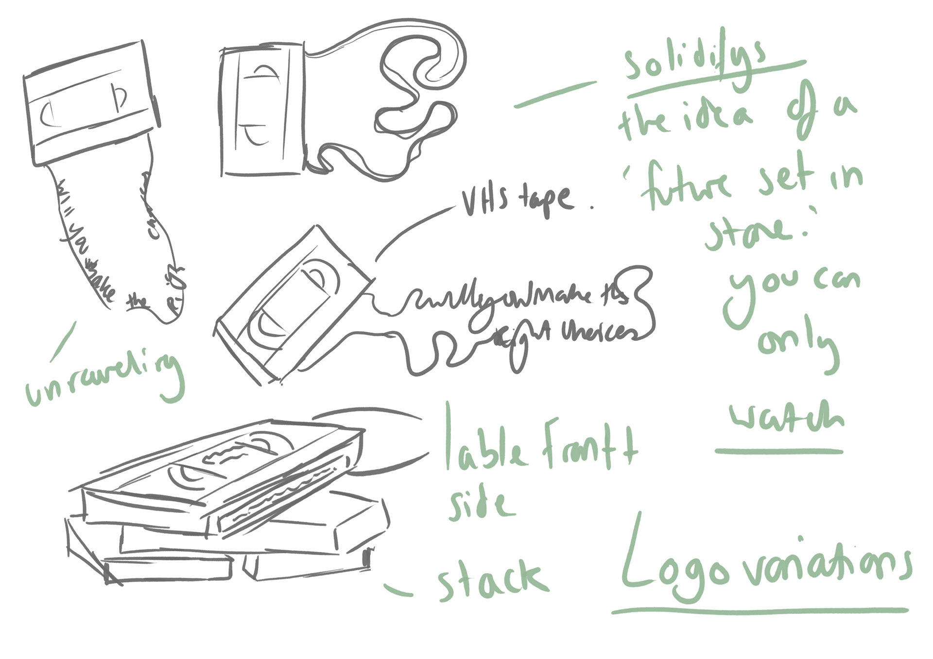
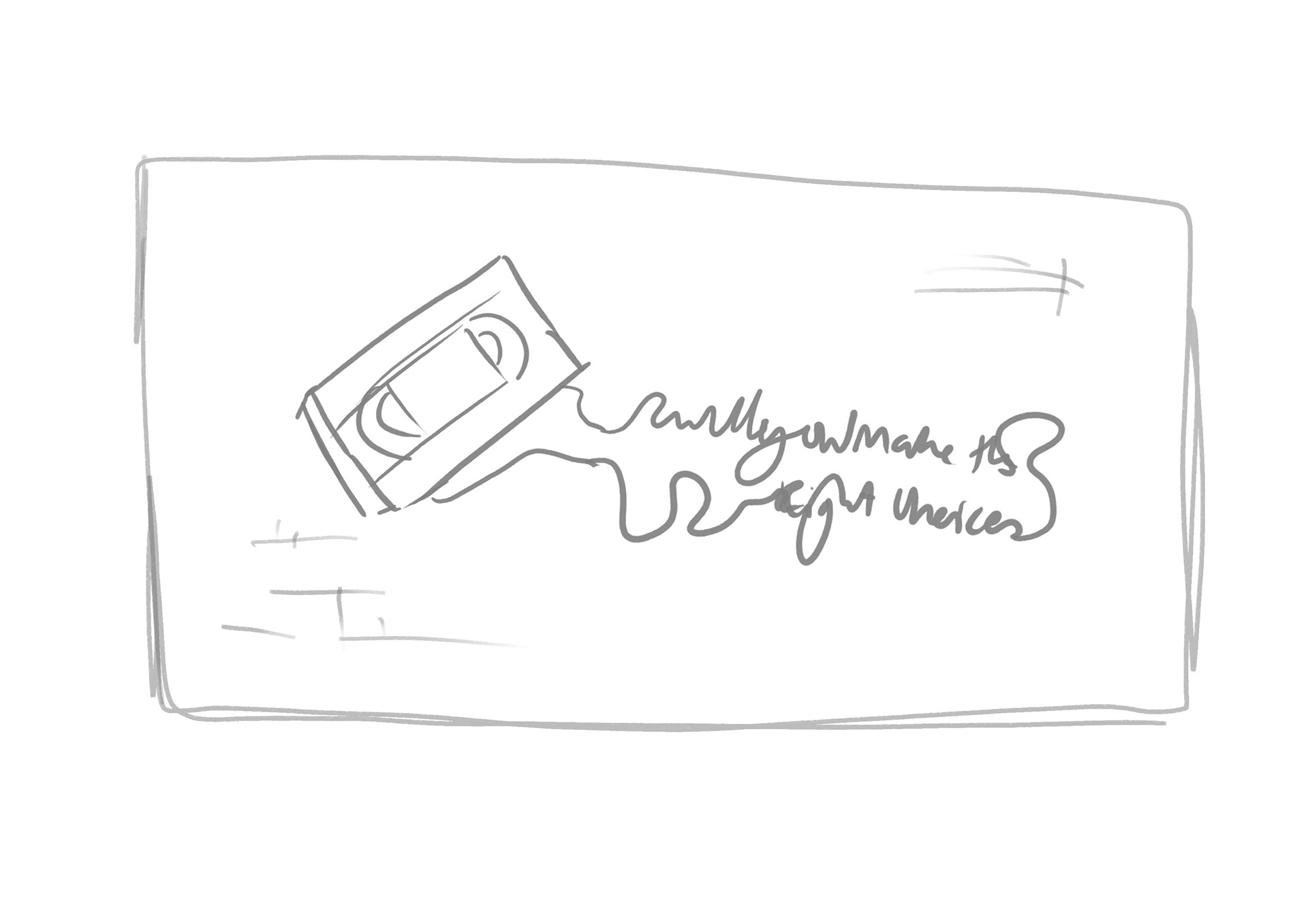
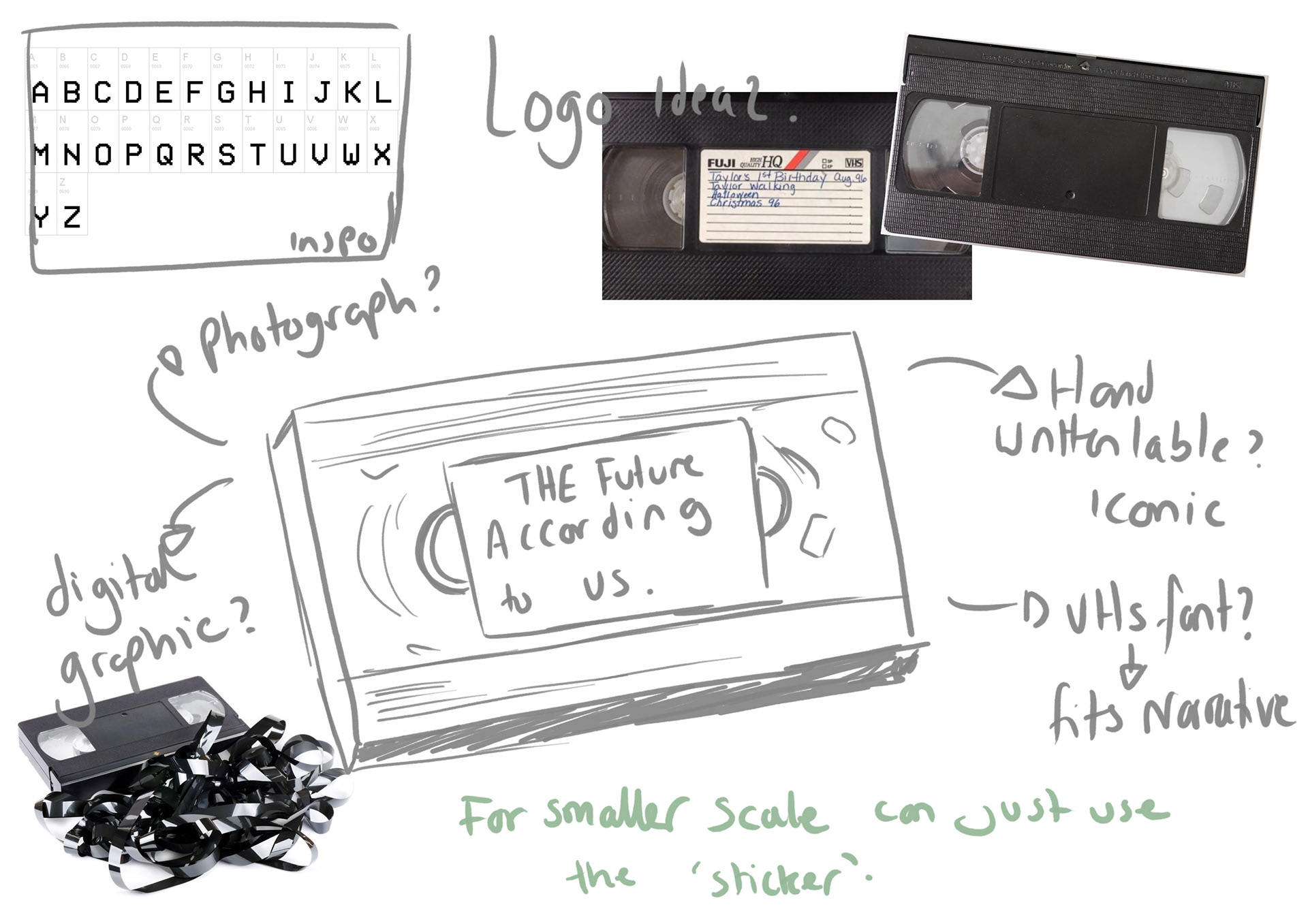
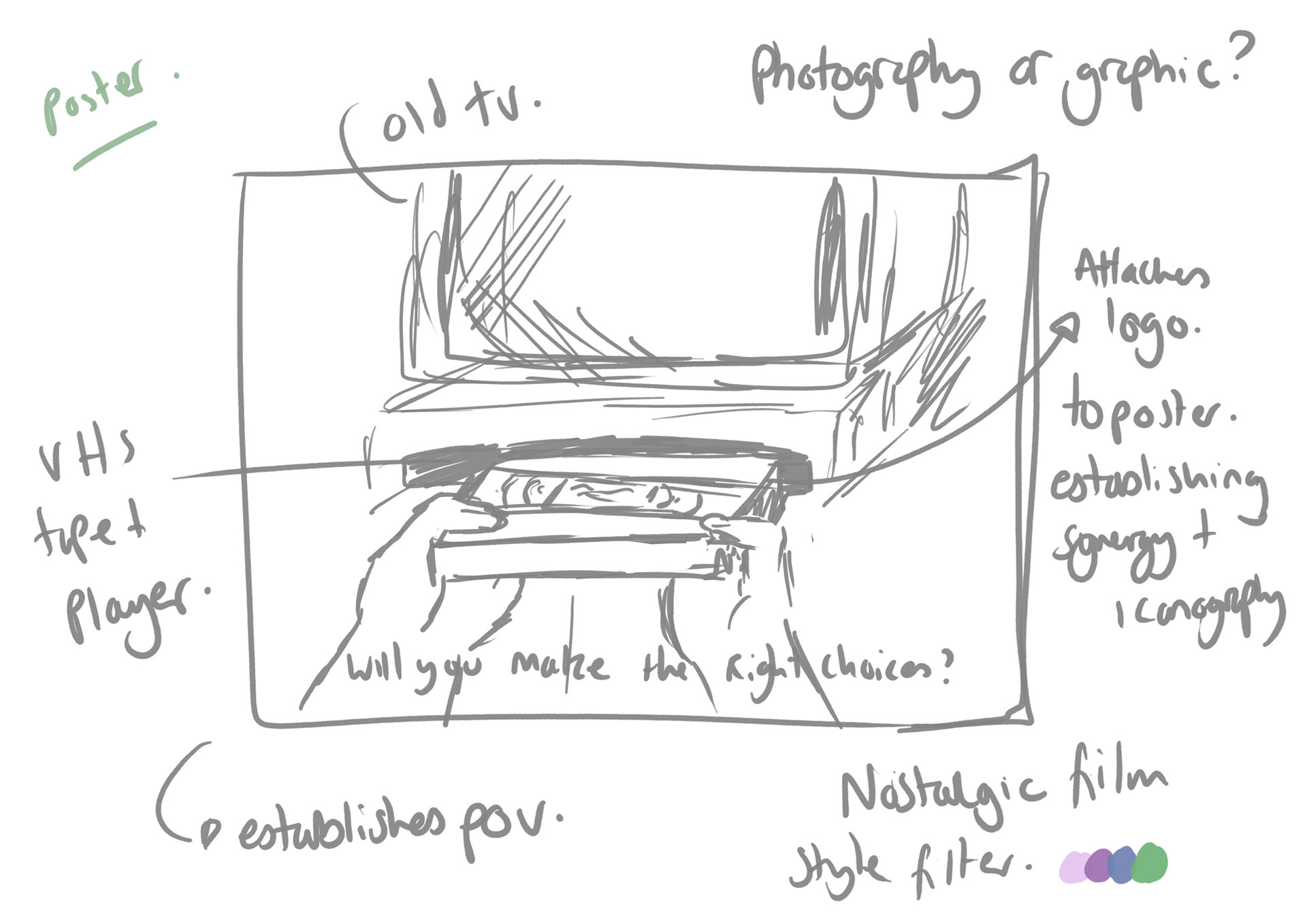


My ideas for our branding surrounded visuals of VHS tapes and retro-style glitches. I also really liked the idea of including hands in the hypothetical marketing material to link back to the suggestions of the climate crisis being 'our own doing' and how our own personal decisions could impact our environment. I wanted to include an exposed videotape reel as a further reference to an action not being able to be undone in reference to the climate crisis.
To bring these ideas to life, I used Adobe Photoshop to design a label for a VHS tape in the style of our decided branding. I used a retro digital font for the title with glitch and grain overlays to solidify the era we were trying to connect with.
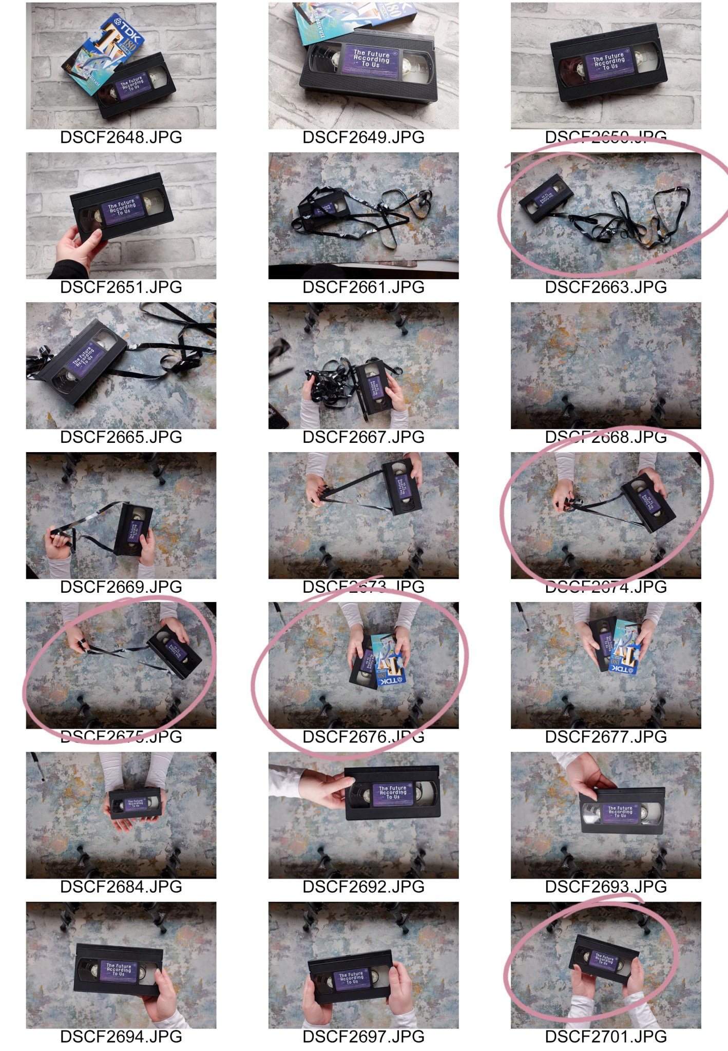
Alongside our interactive video, I wanted to create some hypothetical marketing material to show how our project would be promoted in the form of posters. Inspired by videogame and thriller film posters, I set up a photo shoot using a top-down technique with a grunge backdrop and edited my favourite images using Adobe Photoshop. I to fit the brand and create an enticing insight into our story.
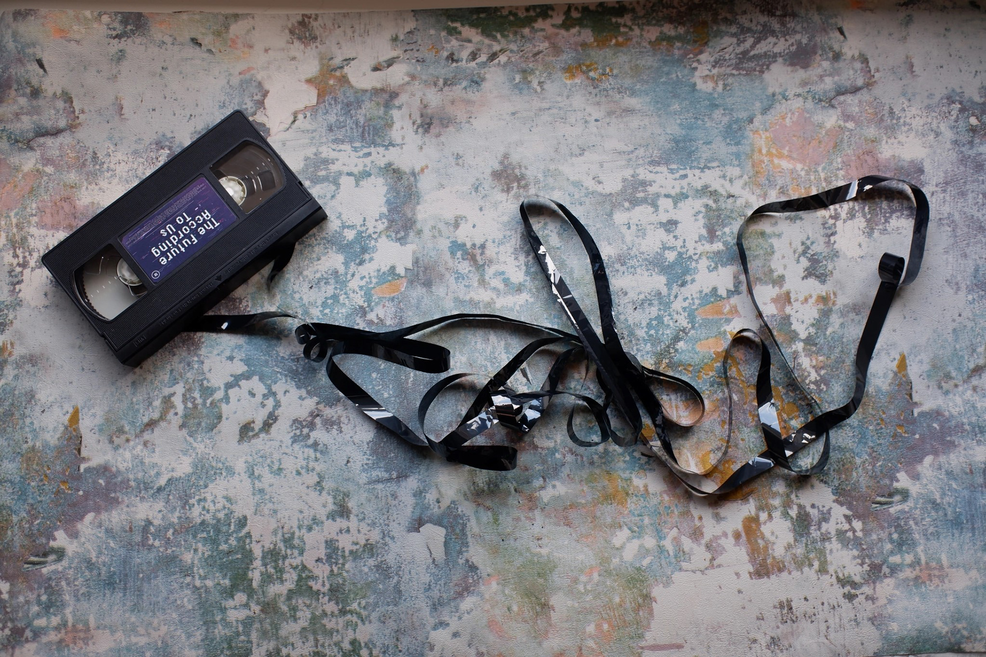
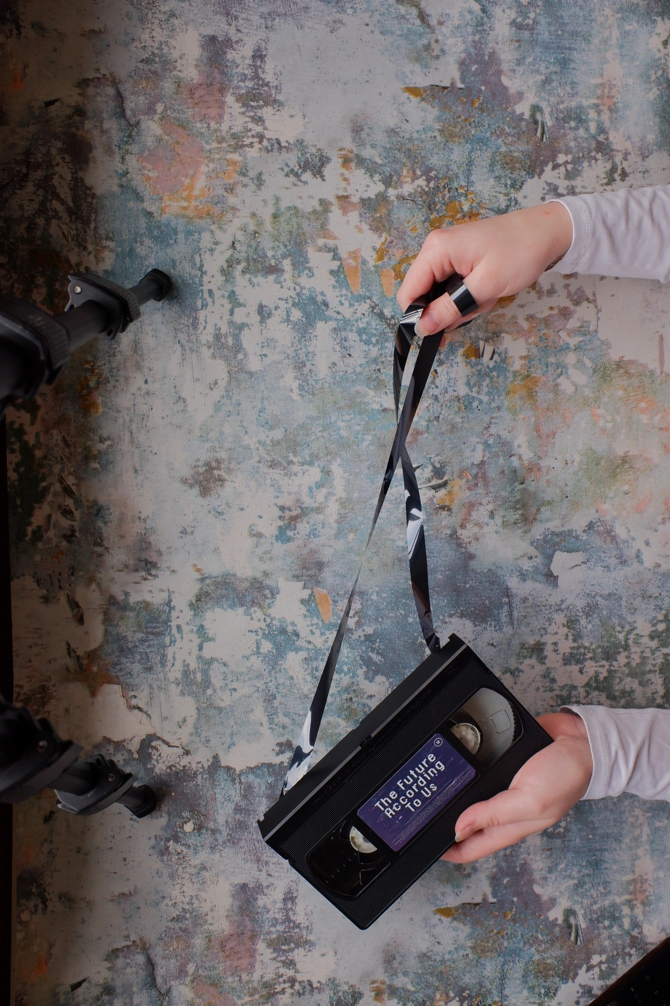
Using Photoshop, I adjusted the colours, removed perfections and added glitch and grain overlays. I designed three versions, in both horizontal and vertical formats for different marketing orientations. I applied our tagline as a hook, posing a question to the viewer immediately initiating the interactive experience. I included placeholder informational text and production logos to increase the visual legitimacy of the promos.