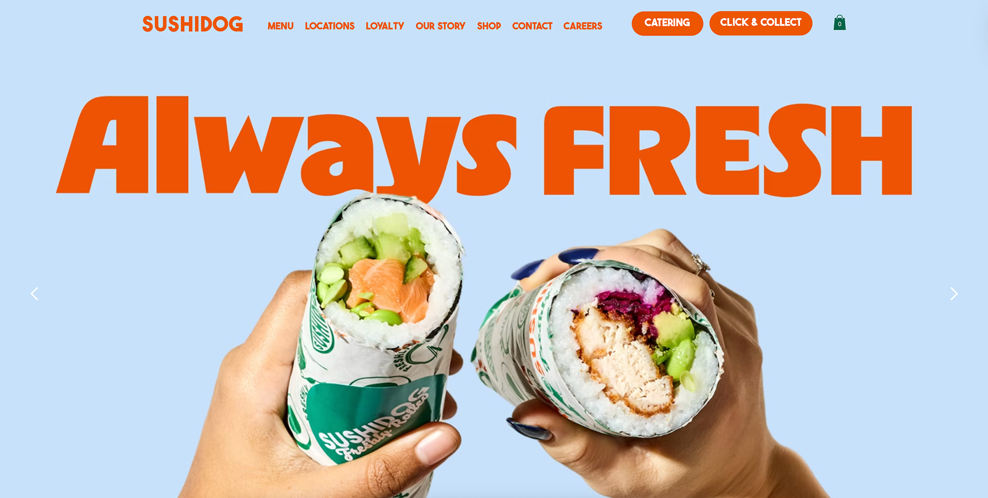
Although Sushidog already has a logo, it is not used very much throughout their website or overall brand style. It has an imbalance of high and low detail. I took a moment to delve into their brand and see how I could elevate it further.
Images via https://www.sushidog.co.uk/
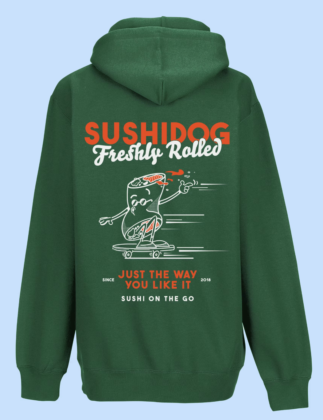

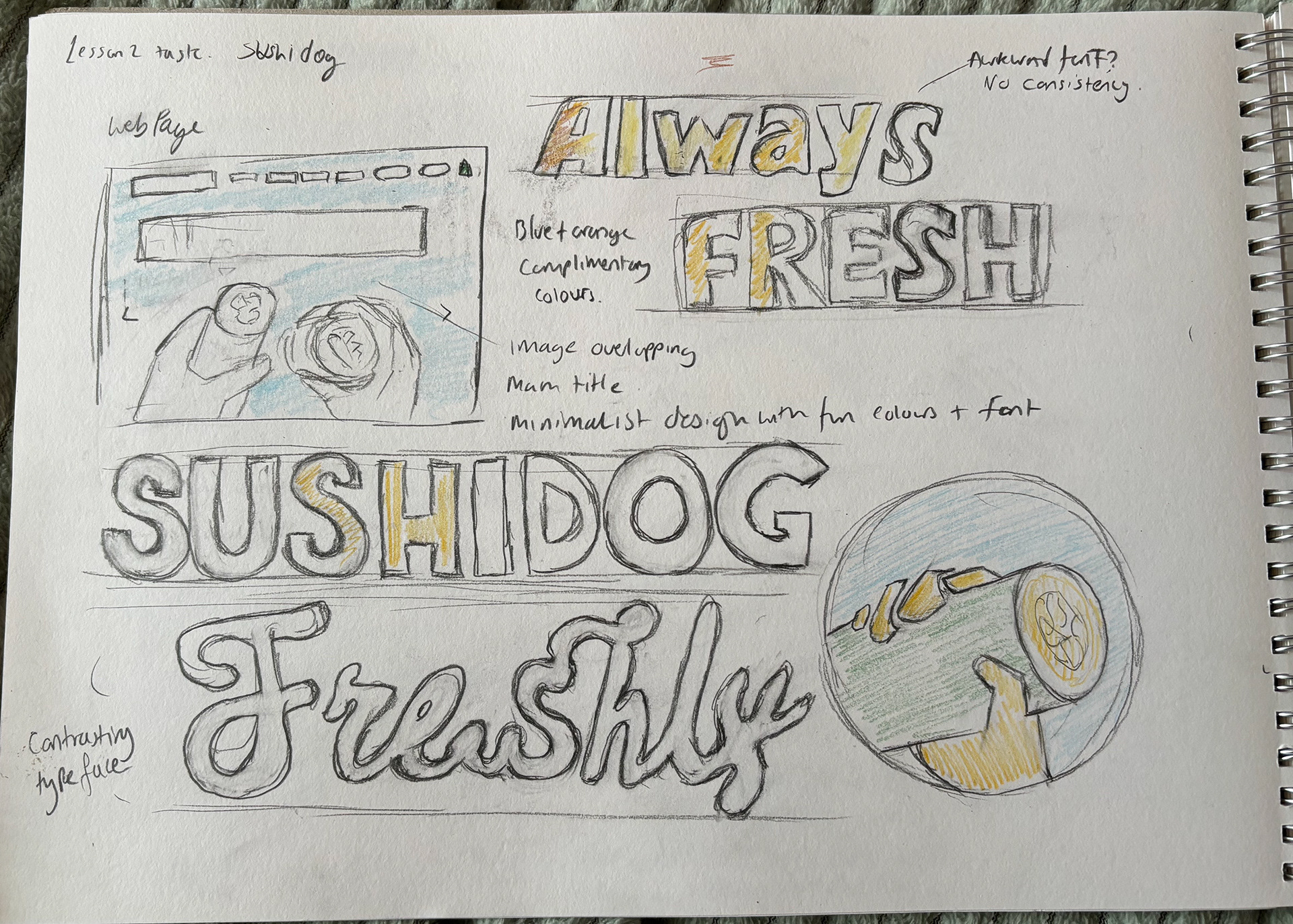
After sketching out the key elements of the webpage, fonts and layout, I found myself wanting to develop their brand further with some updated details, including mock-ups for a new app icon and additional product packaging.
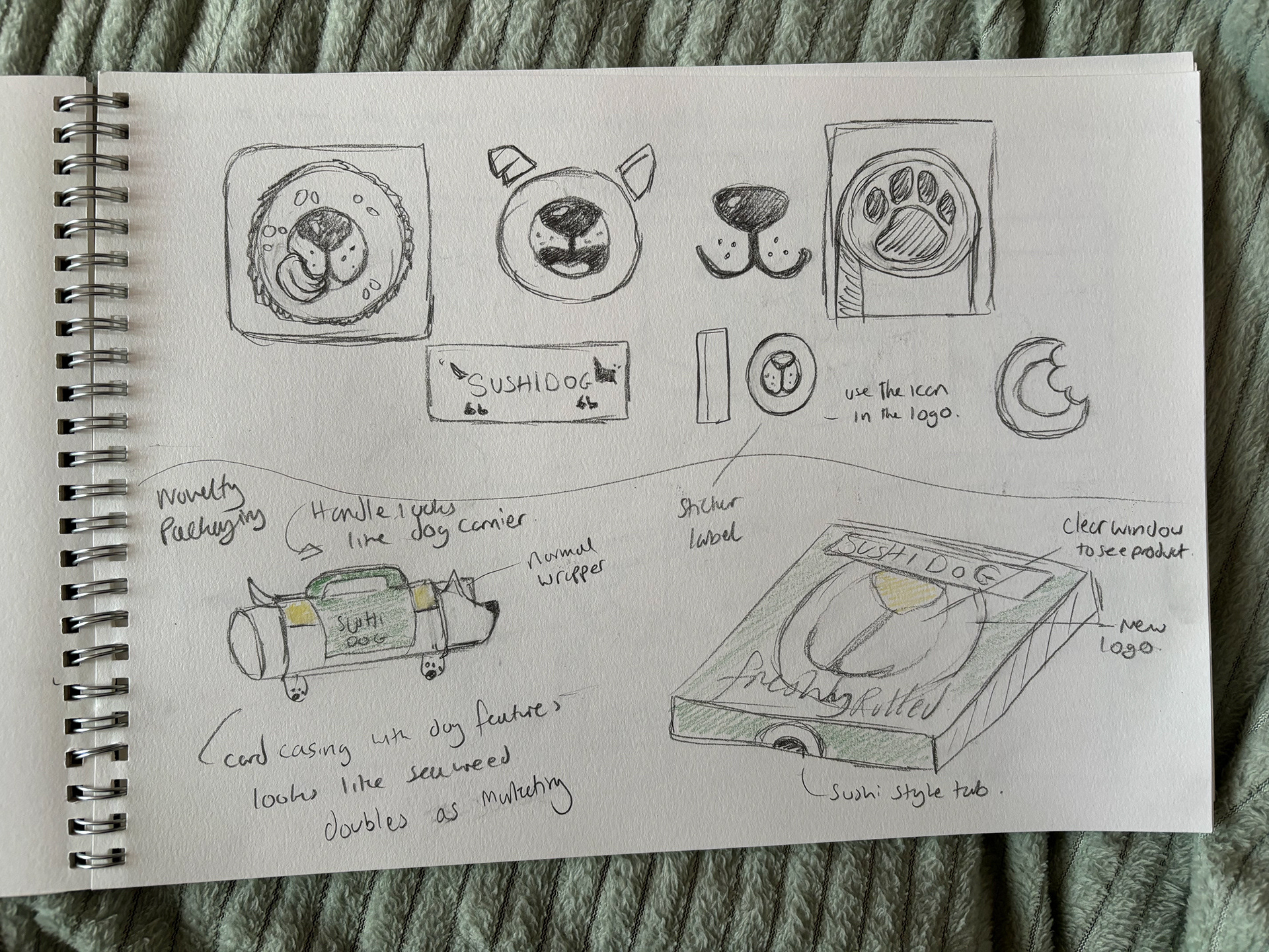
Inspired by cartoon sushi vectors similar to the well-known Wasabi Sushi logo, I wanted to incorporate the fun brand name into the theme of their logo to create a recognisable icon that can be translated into different formats, including their packaging.
I started with some initial sketches, inspired by the cartoon sushi look and dog features like the nose, tongue and paw, which I felt like could fit nicely in the centre of the sushi roll. I used Illustrator to create the more polished vectors to be used in Photoshop packaging mock-ups.
I adjusted their colour palette to create a more visually appealing website using the majority of their existing assets and titles, but bringing the focus onto the most important areas like the logo and the 'menu' button.
I updated the main font used to match their logo font, as I feel it is much cleaner and simplifies the font families used to just two.
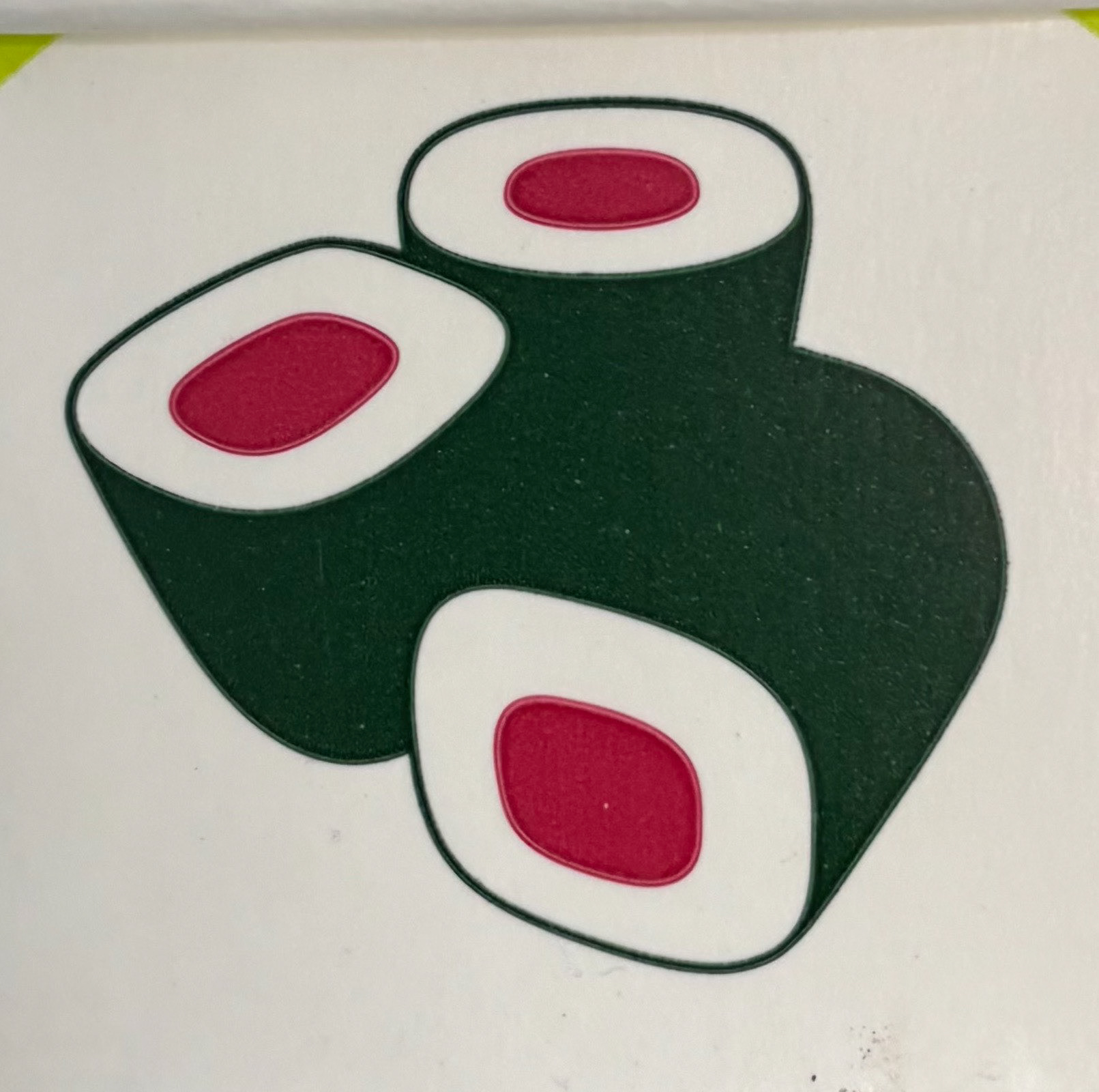
Wasabi Sushi logo
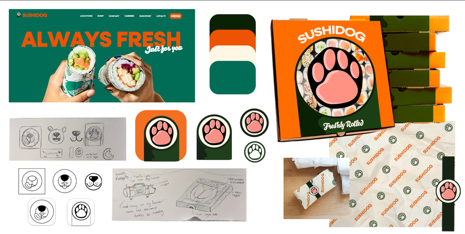
For packaging, I thought of ways to display a bulk order of the food for events as well as individual orders.
For bulk orders, I used an existing pizza box template, as this feels like an efficient use of depth and space to keep a slice of sushi safe in a fixed position. This also provides the opportunity to create a clear window through to the sushi inside using the logo on the packaging as a cutout shape, which brings an element of fun and interest to the packaging. The side of the box continues the logo, creating a repeating pattern when stacked, mimicking the shape of a long sushi roll.
For a single order, their rolls resemble a burrito roll or sub wrap. An initial idea I had was to design a novelty sleeve for the roll in the shape of a dog with handles, which would act as a marketing strategy as well as a type of packaging.
A simpler and brand-aligned design is to follow existing concepts for similar products, using branded wrapping paper. I designed a branded sticker to secure the wrapping paper with extended tabs to mimic the sushi roll style.
https://www.dreamstime.com/set-different-types-sushi-rolls-lot-isolated-black-background-text-copy-space-ready-square-restaurant-menu-banner-image270866251 - sushi in the box
Photo by Teuku Fadhil on Unsplash - wrapper texture
https://loveleafco.com/winter-vegetable-freezer-burritos/ - burrito wrapper mock-up