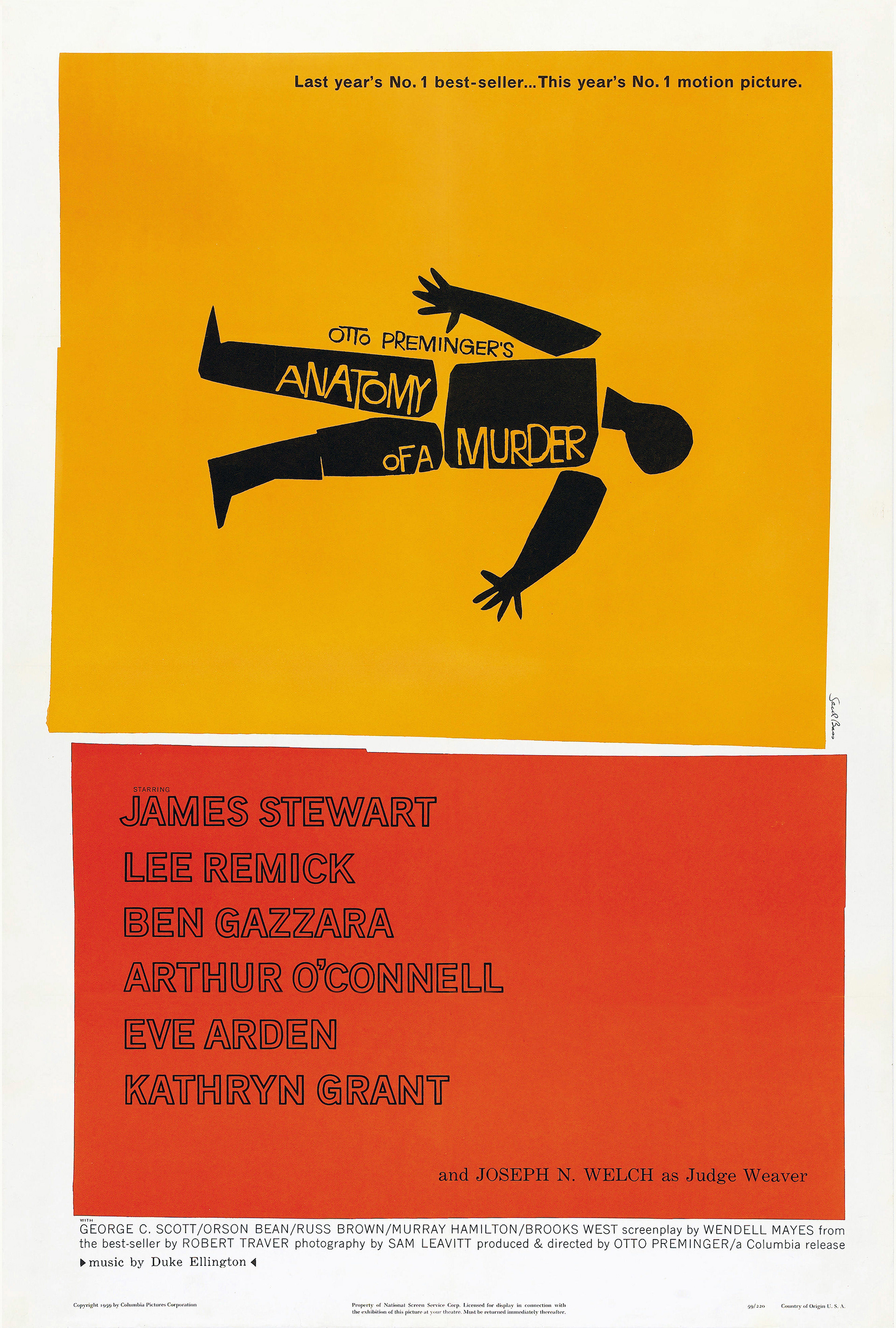
Saul Bass's poster for the theatrical release of 'Anatomy of a Murder' is an instant classic. It is both recognisable and memorable because of the use of bold blocks of colour. The shapes of the colour blocks are asymmetrical and misaligned. This is rather unusual for a poster, especially one as minimal as this; this choice conveys an element of edge and thrill to the design, connecting to the theme of murder.
The simple design includes one silhouetted figure seemingly separated into individual limbs, laid on a yellow background. There is text cut out of the legs and torso of the figure, revealing the yellow background behind.
Below the yellow shape is a similarly cut-out red rectangle. There is a gap between the pieces of paper, revealing the white paper beneath that creates the base and frame of the design. The design uses a combination of cutting out to create lettering as well as print; the main title appears cut out, where the rest of the text, including actors' names and production information, appears printed or digitally added.
The composition of the design is separated by the colour into what looks like an even split between the top and bottom, but the yellow block, including the title, takes up a larger amount of space, drawing attention to the title and artwork, as it is the most important part of the design.
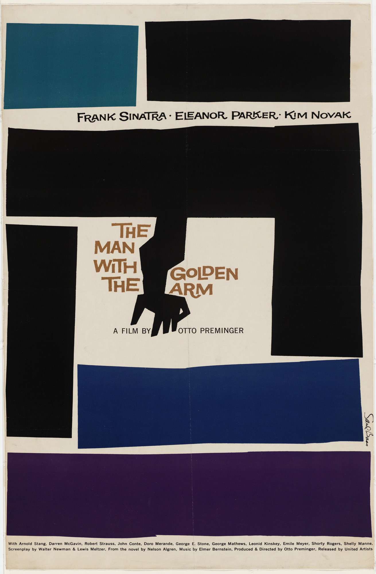
The design for "The Man with the Golden Arm' poster maintains a similar level of detail as the previous poster, whilst using an increased number of shapes and colours.
The colour blocks for this design appear to create a maze-like effect, the edges and lines of each shape guiding viewers' eyes around the poster to reach the central image. The main point of focus of the graphic is the centre, which is framed by the dark cut-out shapes revealing the white background colour and a silhouetted arm extending out of the black colour block.
The text is placed around the cut-outs, separating the title across either side of the hand. The actors' names are also packed quite tightly between two blocks of colour, creating a sense of chaos and suspense.
Once again, the recognisable paper cut-out style is even more noticeable with this design. There are 6 shapes, each one with an organically sliced edge that provides movement and interest, as well as continuing to promote edginess and feelings of a restless nature, which may align with the content of the film.
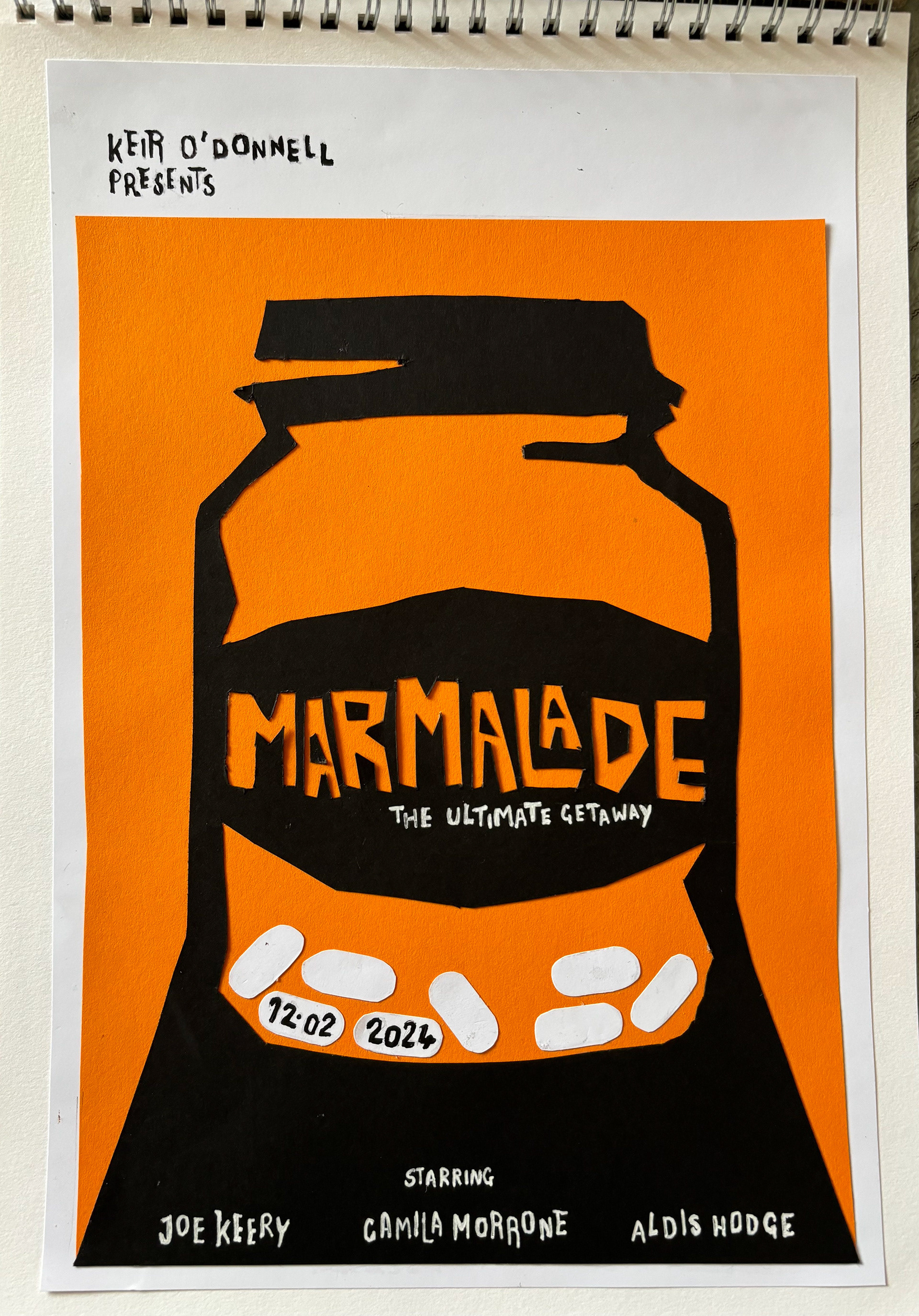
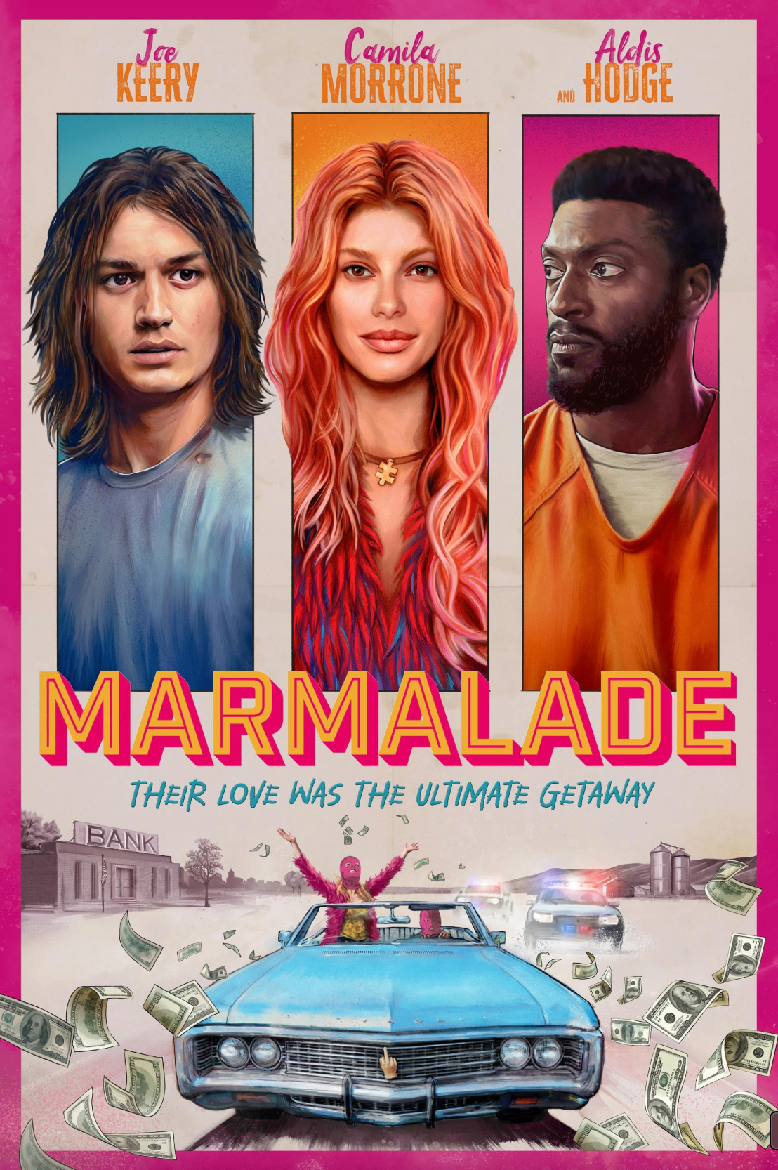
The film I have chosen to base my Saul Bass inspired poster on is Marmalade (2024, dir. Kier O'Donnell). This is one of my favourite films that I think is a great fit for Bass's edgy design, which will capture the film's chaotic yet cheeky energy.
The existing poster already uses bold blocks of colour like Bass to represent each of the characters. I will do the same to bring some of these features into my design, although simplified, as Bass rarely features more than one subject in his designs.
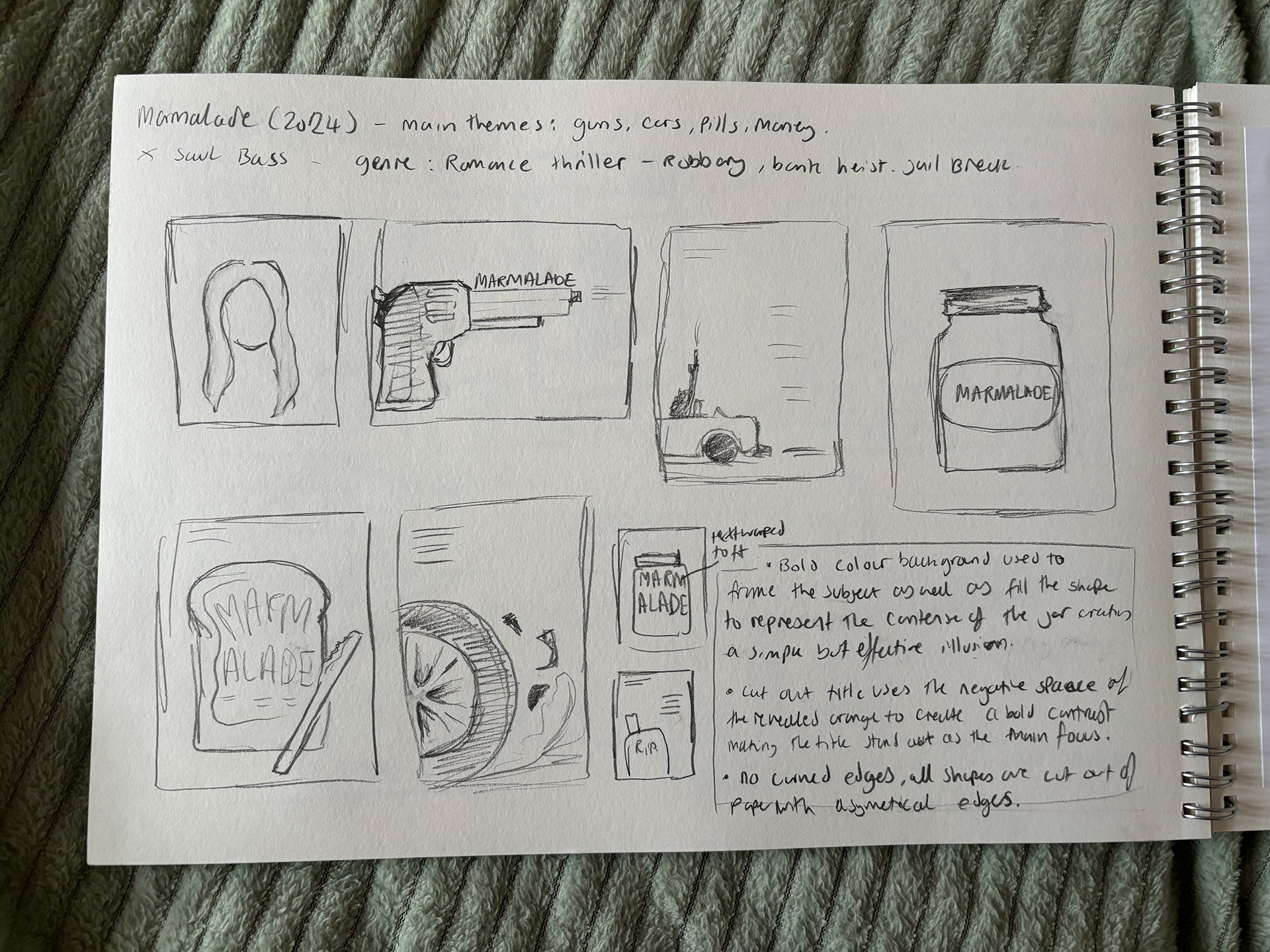
I started my design by sketching out lots of different ideas based on the film's main motifs of: pills, guns and cars. I kept my sketches very simple and brief, not to get hung up on specific details at this point. I picked my best idea and moved to Illustrator, where I know I can draft composition and colour variations more efficiently.
I based my design size on the standard one-sheet US poster size (27" x 40") as this is most accurate to Saul Bass' poster ratio. Info via - https://www.cinemasterpieces.com/cineamericanstyles.htm
My design idea features a jar of marmalade that doubles as an implied American-style medication container, which is a reference towards the film's narrative.
Although Bass predominantly uses figures in his designs, I have used his style and compositional techniques with my own take by using an item as the subject of the design. Although not using a figure may go against Bass' style, it could be argued that the marmalade jar/ pills bottle is the fourth main character in this film due to its importance to the plot and character development it provokes.
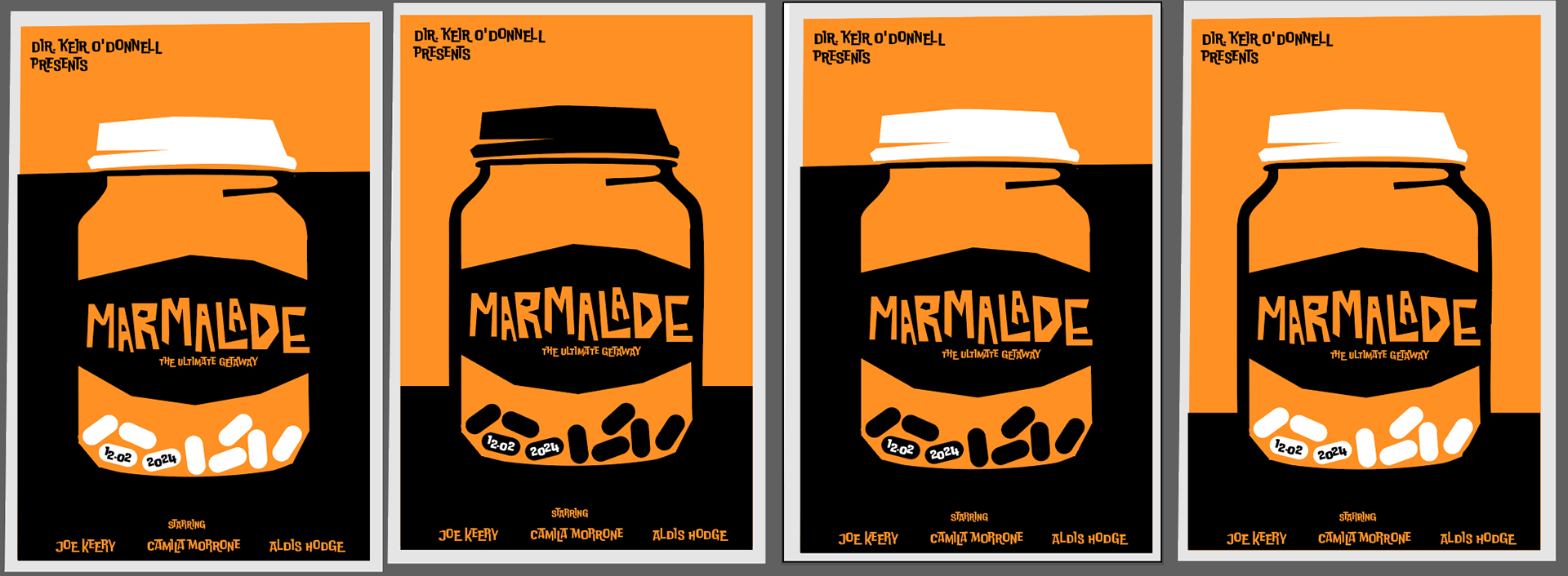
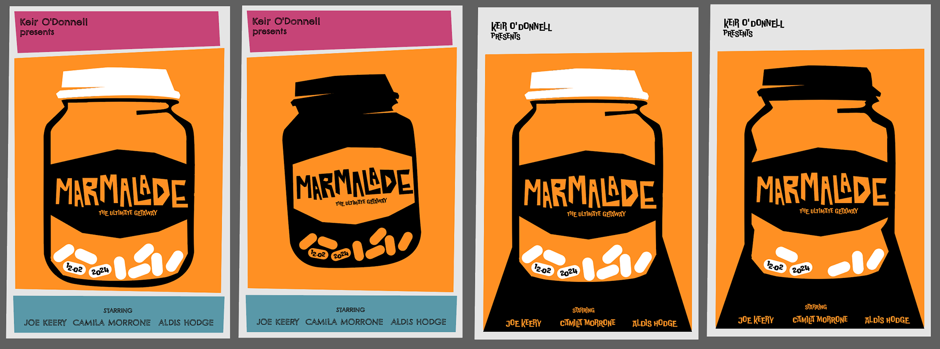
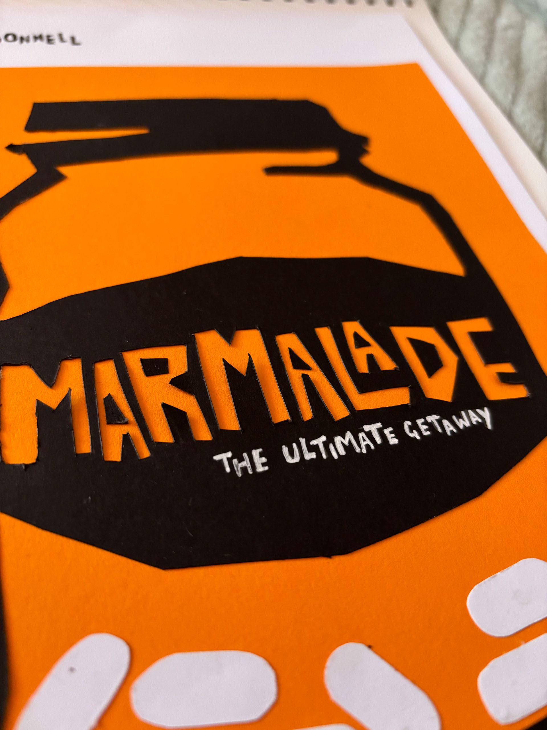
Within Illustrator, I designed many different variations of composition for this design. I experimented with colour both in the background and on the jar itself. I ended up using a limited colour palette of only orange, black and white to mimic Bass's classic style. I've kept in line with this style throughout the design by using only straight edges for each shape, including the font of the main title.
I decided to join the lid to the main body of the jar to create a single shape, as well as a shadow angling toward each corner in the bottom third of the design. This shadow creates a spotlight-like effect for the actor's name, written in a contrasting colour. The visible weight dark black shape is balanced out by the negative space created by the absence of colour at the top of the page.
I cut my final design out of card in true Bass fashion. I mimicked Bass' handwriting with black and white gel pens to contrast against the card.